

SCOPE & OUTCOME
Abound's mission was simple: help parents build stronger readers.
The challenge was translating literacy research into sustainable daily behaviors. Over 17 months, we launched a platform that grew to thousands of monthly active users and earned recognition as a featured Webby Award finalist.
MY ROLE
As Chief Product Officer, I was responsible for turning raw Harvard research into product.
I led strategy, UX, visual design, research, and product development while aligning educators, researchers, engineers, designers, novelists, and parents around a shared vision for how technology could strengthen real-world family interactions.

A blog or stream of content wasn't going to work for this system - we needed high-value moments outside of the app, and that required quick-view, targeted, memorable content delivery.
THE CHALLENGE
Most digital products create value while users are actively engaged, but Abound's system required us to create value after users left.
Parents weren't supposed to spend time consuming content. They were supposed to spend time talking, reading, questioning, repeating vocabulary, and interacting with their children.
The challenge became:
How do you deliver content that parents can remember after they put it down?
Success wouldn't happen in the app - it would happen hours later:
During the drive to daycare
At the dinner table
During bedtime reading
In spontaneous conversations throughout the day
The app couldn't be the destination - it had to be the catalyst. And the moment of value had to be strong enough to bring parents back daily.
DESIGNING FOR BEHAVIOR, NOT SCREEN TIME
Research consistently points to three foundational drivers of literacy development:
Awareness & Regulation
Letters & Sounds
Vocabulary & Knowledge
Research also shows that children build these skills through three primary forms of interaction, and most effectively with parents:
Novel Conversation
Verbal Repetition
Structured Reading
The challenge wasn't simply delivering this information, it was enabling parents to remember it, use it, and return to it.
That meant every design decision needed to support behavior outside the app while encouraging regular (daily) engagement with the app itself.
"Sure I want to have stronger conversations with my daughter, but how can anyone expect that to include a screen?"
CONSTRAINT #1:
Content had to be memorable.
Most apps assume users can return to content whenever they need it, but we couldn't - a parent might open Abound at breakfast and not use the content until bedtime.
Every activity needed to be simple enough to remember hours later without reopening the app.
We distilled each day into three features that provided highly memorable interactions:
Talk On: A question worth asking.
Word Up: A word worth repeating.
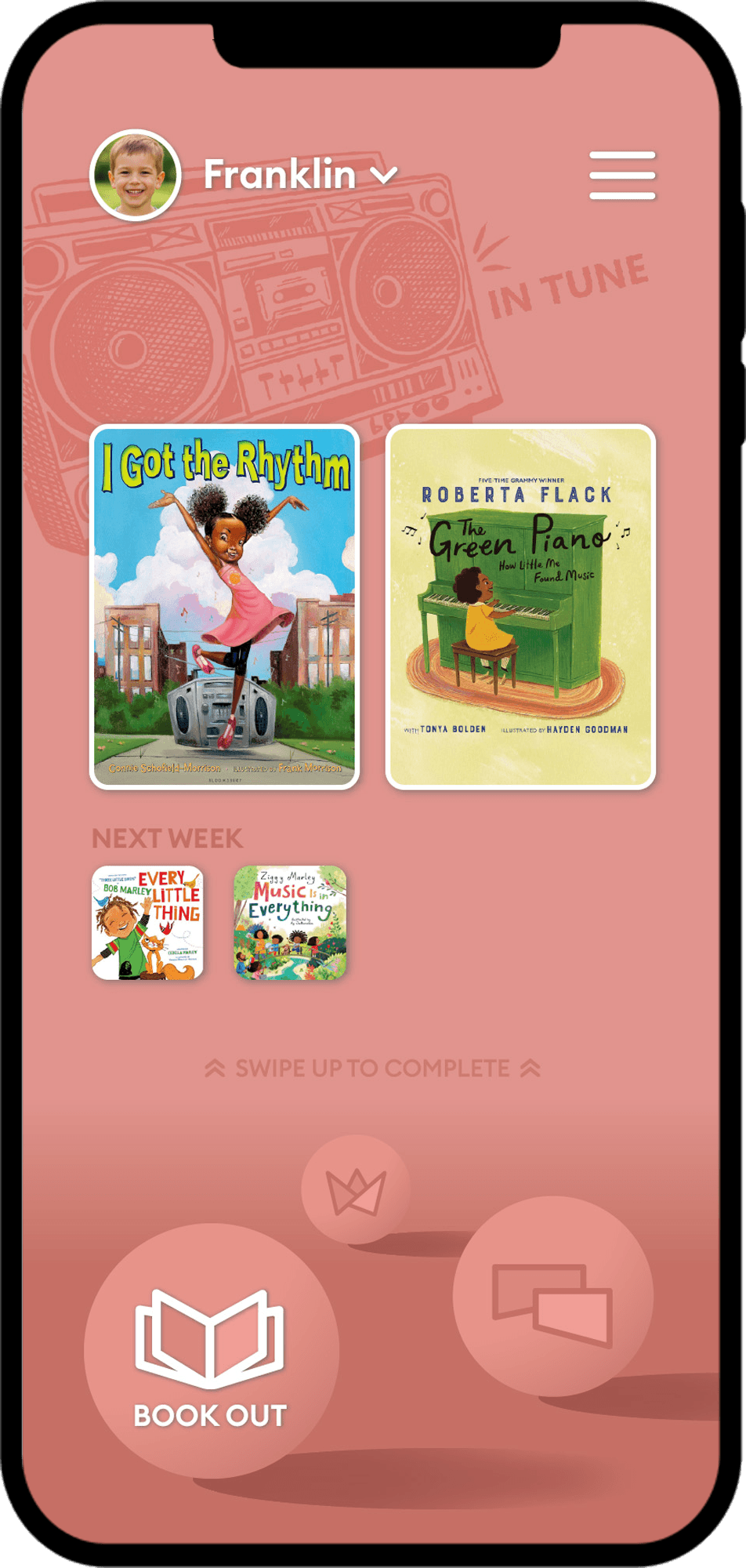
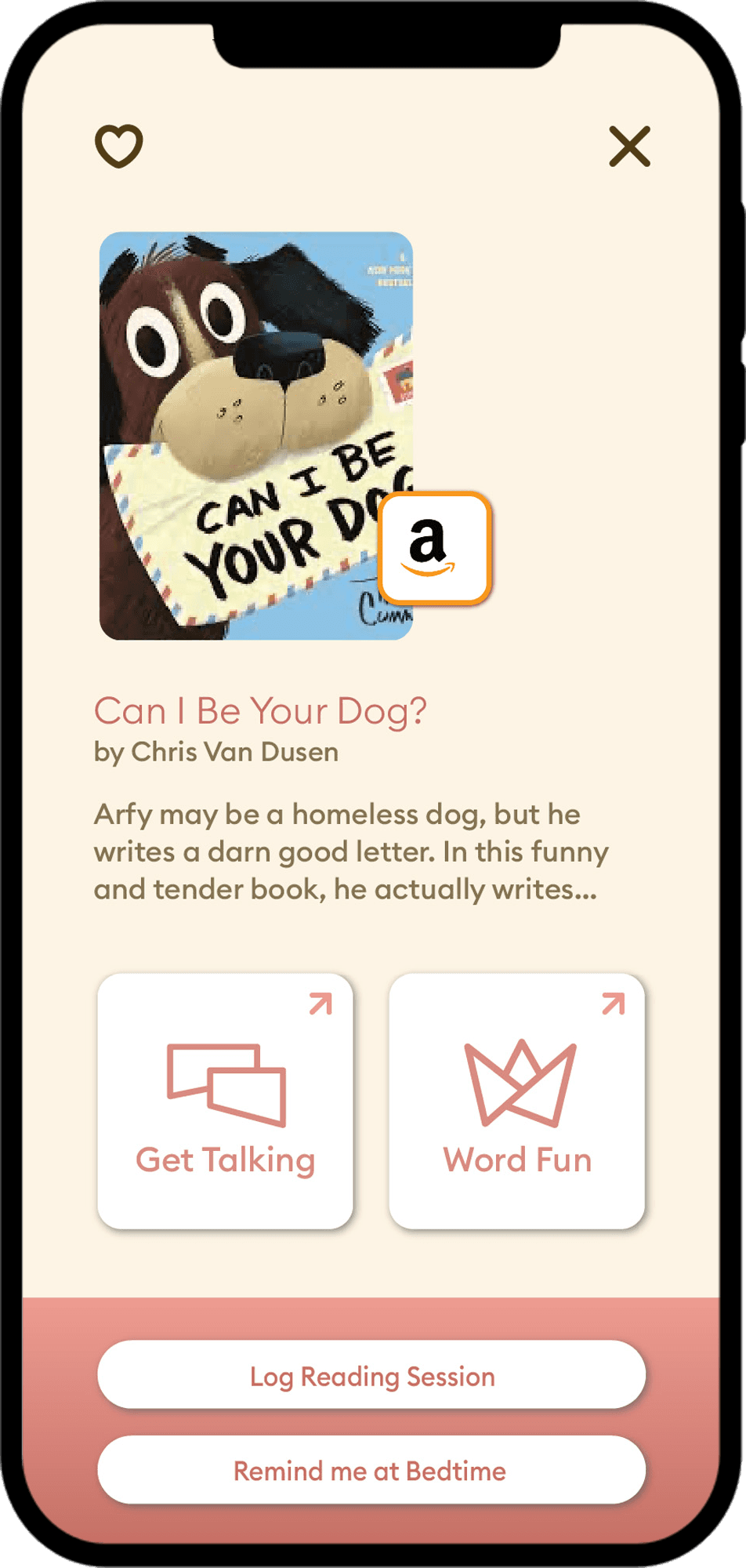
Book Out: A book worth exploring together.
The goal wasn't content consumption. The goal was concept retention.
Through testing with users, we realized parents didn't need much to retain the concepts throughout the day, as long as the content was as interesting to them as it was for their kids. We could give them the basic idea and let them run with it when the time came.
CONSTRAINT #2:
Every off-screen interaction needed to produce an immediate reward.
Long-term literacy outcomes are powerful, but parents don't experience long-term outcomes today. They experience today's conversation. Today's laughter. Today's curiosity. Today's connection.
For our primary user, the strongest rewards needed to be emotional, not educational.
Every prompt needed to create a moment that felt worthwhile in the moment, while simultaneously supporting long-term literacy development. The best interactions felt less like homework and more like discovering something new about your child.
This meant high-quality content (we brought in an award-winning novelist to make sure we're giving parents the good stuff), as well as a place to save and share the memories created.


CONSTRAINT #3:
We had to compete with infinite scroll.
Many apps solve engagement problems by adding more content.
But we found that limiting to targeted, high-quality content they could trust is what kept bringing them back.
Instead of feeds, recommendations, and endless discovery paths, we reduced the experience to a single destination.
One screen. Three activities. No searching. No scrolling. No wondering what to do next.
We present three pieces of content in one environment and they update daily. This was achieved visually with a monochromatic theme for each of the three - Blue, Green, and Pink. A revolving animation partnered with a fade between modes made for an engaging and interactive "world."
DESIGNING A WORLD WORTH RETURNING TO
Most educational products answer this with notifications, streaks, badges, and gamification. We chose a different approach, building an engaging world.
Instead of presenting content as a feed, we created an environment where parents wanted to spend time.
The home screen became a landscape. Weekly themes transformed the sky. Illustrations changed with the content. Three floating orbs represented the core activities. As parents complete activities, a quick swipe up lifts lifts the orbs, the sky dims, and the orbs glow triumphantly. Progress wasn't represented as a number, but a world coming to life.
The visual system served an important behavioral purpose: parents needed to quickly understand where they were, what mattered today, and how much progress they had made. The visual world made that information memorable, emotional, and rewarding, driving them to bring that world out to their kids.


DESIGNING FOR DELIGHT
Educational products often become overly instructional, but we wanted Abound to feel playful, imaginative, and welcoming without becoming childish.
The visual language borrowed from storybooks, fantasy, and children's literature while remaining sophisticated enough for parents. We used vibrant but refined color pallettes, hand-drawn illustrations, and clean design elements to appeal to parents' imagination. Interactions rewarded exploration.
The goal was to create an experience that felt less like an educational tool and more like a companion.


SUPPORTING THE CORE LOOP
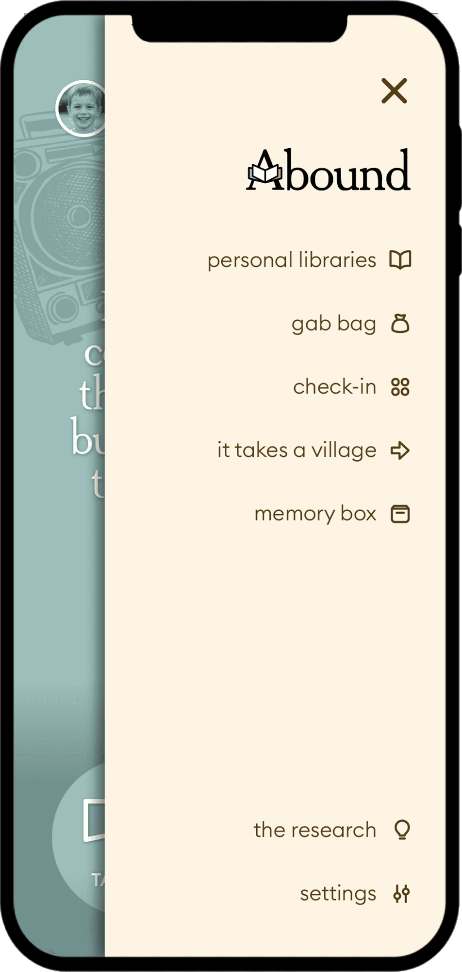
While the daily experience remained intentionally simple, we built a broader ecosystem around it, all accessible through one exit point from the main environment. These include a curated library of books, a repository of any-time conversation starters, developmental assessments, a place to log memories, and a learning center about parent-child interactions and their effects on literacy.
These features expanded the value of the platform without distracting from the primary behavior loop.


THE OUTCOME
Parents consistently described using Abound in exactly the way we intended. Reviewers and testers frequently referenced:
Better conversations
More meaningful family interactions
Increased confidence as parents
Greater engagement during reading
Practical guidance they could immediately apply
The strongest validation came from hearing parents describe routines we had intentionally designed for:
"I love checking it out before I get in the car to kickstart some great conversations."
"This app has become part of my daily life."
"Great conversation starters for me and my kids."
But honestly nothing was better than the post-launch research. Watching parents and kids create joyful, spontaneous memories inspired by our content was the best part of the whole project. Isn't it always?
We built it from zero to thousands of monthly active users, dozens of school system partnerships, a 5.0 star rating on the App Store and a 4.3 rating on Google Play. Our little startup was even a in a final-five for a Webby with the likes of MasterClass and Rosetta Stone.



WHAT I LEARNED
Abound really empowered me to always question how things are done today. The most impactful experiences don't always create value inside the interface - sometimes their greatest success is what happens after the interface disappears. We can design for that and be successful in the marekt.
While I was the CPO of this company, the design I did for the app was the real game-changer. We developed something that changed behaviors, spread joy, strenghten reading skills, and brought people back to the platform consistently.
The experience reinforced a lesson that continues to shape my work today:
the best products don't replace human relationships. They strengthen them.
